Sunday, April 15, 2012

Green-Washing?


I came across this little blurb in Glamor magazine this week at the hair salon. What a great encapsulation of the whole "green washing" phenomena that is sweeping America. Women, in particular, are susceptible to this with foods that portray themselves as healthier, lower in calories and more wholesome creating the misconception that they must also be "good for us." We are suckers for "green" beauty products, too. As the illustration above states, the only real way to know if a product truly IS green/organic/natural/etc. is to READ THE LABLE!

In pursing my local grocery store, I came across an example of green-washing in the snack isle:


The "smart" popcorn in the green package touts itself as being healthy and "94% fat free"and only 100 calories, but turning the package over and looking at the nutrition information label and ingredient list reveals a long list of ingredients and additives that have absolutely nothing to do with popcorn. The jar of popcorn below contains only one ingredient - popcorn kernels. That's it. AND it's considerably cheaper, by weight than the box of individual packets above. AND, there are no health claims, special packaging, or enticements on the label. It would be easy to pass this up, thinking that a "healthier" choice surely must be one like the package above, but, seriously, which one do you think really IS healthier?

We are bombarded with messages/claims on packaging and in advertising for foods and beauty products constantly. It can be difficult to sort out the facts from the hype. Think about the "Milk, it does a body good" campaign (that also includes the admonition to consume 3 servings of dairy a day to maintain "lean weight"). This is a great example of advertising that poses as educational. How can you become a more savvy shopper? Some great questions* to ask yourself when trying to determine if a product is really worth purchasing might include:

Who made this message?
Who is the target audience (and how do I know)?
Who might benefit from this message?
What is left out of this message that might be important to me?

Think about the package colors (greens, beige, off-white, brown), the graphics (produce, farms, "happy" looking animals, leaves, burlap-like textures), and the wording ("100%" ... but 100% of WHAT? "contains NATURAL/ORGANIC ingredients" does not mean the entire product is natural/organic, only that something in it is...).

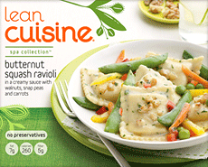
Here are a few other examples of green washing:


*Questions from NAMLE's (National Association for Media Literacy Education) Core Principles of Media Literacy Education

Monday, April 9, 2012

An Ounce of Prevention Costs WHAT???

We like a bargain, but we are also keen on convenience and aesthetics.

A recent trip through the grocery store revealed that there are lots of options for satisfying our appetites out there - from heat-and-eat meals to pre-packaged calorie-counted snacks, but it can be difficult to know what, exactly, we're purchasing when we buy the boxed items.


These "weight control" oats (also, note the "heart healthy" decoration) only cost $2.54 per box, but this box - despite its size - only contains 12.8 ounces of oats. Per pound, they cost $3.39. Still doesn't seem like such a big deal? You could purchase rolled oats in the bulk foods section of many grocery stores for less than $1.50 and flavor them yourself. If your grocery store doesn't have a bulk foods section, compare the price of the big round box of oats. It will be much cheaper. When you buy those special single-serve packages, your paying for the packaging in addition to the ingredients within, and often the packaging is costing you more than the the cost of the ingredients.


Another example of paying for packaging is with these fruit crisps. While the box costs $2.99, look closer to see what that $2.99 is buying. The net weight of the entire box of food, despite the fact that it contains TWELVE crisps (as noted prominently on the front of the package) is less than half a pound. It is actually 5.28 ounces. This makes the price per pound for this product $9.06!


This package takes the cake - literally - as the biggest rip-off I encountered during my trip. The appeal of the 100 calorie-ness of these Fudge Grahams must lie with it's enticing message that reassures us of how "right" eating these snacks are (i.e.: "Right Bites" AND the fact that the prominent color on the package's signage is a reassuring blue [see previous post about the psychology behind colors used in advertising]), because it certainly would not possibly be that of value. While this package "only" costs $2.69, the TOTAL WEIGHT OF THE PACKAGE is an unimpressive 4.24 ounces! No wonder they are only 100 calories. Air has 0 calories. Sell air in handy 6-packs for $5.00 each and you could make a fortune selling to all of the calorie-conscious consumers... The cost per pound of these snacks is $10.15!

Compare these prepackaged foods to some others I came across:

1 dozen eggs $1.19 (just under 10-cents per serving)
1 lb dried black beans - $1.49 (makes approx. 6 servings, cooked, for 25-cents per serving)
1 lb apples - $1.49 - $2.49
1 lb broccoli - $2.49
1 lb green cabbage - $1.49
1 lb lean ground turkey - $6.99

While I don't expect you'd be drawn to a stalk of broccoli in quite the same way you'd gravitate toward some cookies, being a savvy shopper includes knowing what you are purchasing, and I thought this illustrated the difference between the cost of food and the cost of packaging. Understanding the difference between purchasing food and purchasing packaging is huge. Look for ways to minimize the amount of money you are spending on cardboard, foil and plastic, if your budget or dietary needs do not allow for that "luxury". While I would agree that most everyone would benefit from more fiber in their diets, getting it through cardboard is not the answer ;-).

In addition to the serving sizes, it's also important to check the weight of the food within the package so that you are completely informed about what, exactly, your food dollar is buying. Yes, it seems super time-consuming to attempt to calculate every item you purchase. So, maybe you don't calculate each and every one, all at once. Check out your pantry or cabinets. Find one or two items you routinely purchase and calculate the price per pound, just so you have a point of reference the next time you shop (boxed cereal is a great one to try). Gradually, you'll develop a keener eye for the price per pound of your favorite staples. You just might be surprised how little you've actually been buying!

Sunday, April 8, 2012

Heart-Breaker


Seriously.

The labeling on this product is unbelievable. What's in a name, anyway?

Large sections in grocery store isles are full of products like these. Healthy Choice is not called Healthy Choice because some wise entity has determined these products to be healthy. They are called Healthy Choice because somebody, somewhere knew that IF they were called something that led consumers to believe they WERE healthy, consumers would buy them. It's kind of like the name that a certain golden-imaged fast food chain trademarked for the product that they placed between their buns... "100% REAL Beef." They could have trademarked the name "Fred" for it, because after all, the chain was not stating that what they served was "real beef," or that their "real beef" was something that contained the parts of the animal that you or I would call "beef," rather, that they were naming what they served "100% REAL Beef."

The soup above is a prime example of this funny style of message shaping. The little heart-shaped icon in the upper right-hand side of the package front looks similar to the one "used" (i.e.: sold) by the American Heart Association to designate that particular processed foods have met a (fairly loose) criteria for being "heart-healthy" (common translation: it won't do too much damage...).


The heart on the Healthy Choice soup is one created by ConAgra Foods, Inc. - the company that makes Healthy Choice products, but it sure looks official at first glance, doesn't it? Note the little tiny asterisk (*) beside "Heart Healthy." Looking carefully at the package reveals a little tiny message in little tiny font (maybe a .5?) that states: "While many factors affect heart disease, diets low in saturated fat and cholesterol may reduce the risk of this disease." While that may be true, there's more to the heart disease story.


Below the ConAgra logo, it states that this soup is only 110 calories only contains 390 mg of sodium. Sodium is a HUGE factor in the development of heart disease. Many Americans consume way more than the 2400 mg that is currently recommended as the maximum daily limit for a healthy diet for a person younger than 50 years old, who is not overweight, or in otherwise poor health. The ideal threshold for safeguarding your heart-health, according to Michael Jacobson (the guy who lead the movement to get those nutrition information labels on our food products in the first place, back in the late 1980's) is 1500 mg/day. He and other researchers, including Walter Willet of Harvard's School of Public Health believe that if this 1500/mg threshold were the "norm" - and therefore, food companies were forced to lower their sodium amounts in the foods they process - more than 150,000 lives could be saved every year that are otherwise lost to heart disease (which is the #1 killer of Americans).

SO, here's ConAgra's reassuring "Heart Healthy" icon on this soup - this soup that comes in a handy-dandy microwavable dish that allows you to heat up your lunch in the break room microwave and enjoy it at your desk... only, when you turn the package over


... you can see that those guys at ConAgra don't really intend for you to eat the whole bowl of soup that you've just heated up at work all by yourself ... they are thinking you will probably share it with your co-worker at the next desk, because this is actually considered two servings of soup. You see, one serving of soup contains 390 mg of sodium. If you ate the entire bowl, you'd be consuming nearly 800 mg of sodium - which is way more than anyone should probably consume in one meal if they are concerned about the health of their heart... and of course, ConAgra knows this, that's why they've divided up this bowl of soup into servings for two people.

Tricky, huh?

It pays to read beyond the front label on food packaging. Don't be tricked by the little icons and promises that attempt to lure you by creating an image that a food is healthy. Turn it over and read the back. Keep in mind that serving sizes are often adjusted on the BACK of a package to make their calorie-count and other key items like fat, sugar and sodium appear much more "palatable" than they may actually be.

American Heart Association check mark from: http://www.heart.org/HEARTORG/
All other photographs were taken by the author

Saturday, April 7, 2012

What's So Special, Anyway?


Marketers know what you are looking for and how to make you think that they are the only ones able to give it to you in a way that is attainable. Products that promise weight-loss are prime examples - especially for women.

Other key categories are those that promise to be
QUICK
CONVENIENT
HEALTHY

In the Special K TV ad above, the idea is that your body can be "worthy" to be seen, as long as you are the "right" weight/shape (so, if not, by all means clutch that cover-up for dear life, right???). The way to attain the "right" weight/shape is to take the Special K challenge. That way, you can "lose the cover-up and show off your confidence."

Confidence = weight-loss

Sounds promising, right? The current marketing pitch is that women can lose up to 6 pounds in 2 weeks, IF they replace 2 meals per day with Special K (or, conveniently, other Special K products like waffles, fruit crisps, protein shakes, or crackers), and then eat one fairly regimented meal (as outlined on their website). Also interesting to note is the dominant color with Special K - it's present throughout most of their advertisements, as well as the color of their logo. Whether we are aware of it or not, red is equated with energy. It increases heart-rate and creates a sense of urgency (see previous post on how color evokes particular responses in people). Getting caught without your cover-up, unprepared, in a public place IS urgent, isn't it?

It's also interesting to note that the other women on the beach are dressed in lose-fitting, dull-colored clothing and one's wearing a floppy hat.

NEWSFLASH:  there's nothing magical about Special K. Research the details of any promises/claims made on the front of the packaging (ie: "Drop a jeans-size in 2 weeks," "Lose an inch in 2 weeks," etc.), then read the nutrition information label to compare the product in question with other similar products - in this case other cereals, waffles, bars - to compare serving sizes/weight and nutrients. Odds are good that you could accomplish the same effects eating a cheaper cereal (like a less "flashy" brand, or a generic one), if a cereal-diet is what you're in the market for (although, there are much more satisfying and healthy ways to lose weight).


Trying to control your appetite? One of the MOST important pieces of information on a nutrition information label, when deciding on which processed food to purchase is the comparison between grams of fiber and grams of sugar. FIBER is what helps to curb your appetite. FIBER is what takes longer for your digestive system to deconstruct and process, creating a longer lag time between your current hunger and how soon you'll be hungry again after eating a particular food. Conversely, SUGAR is what primes your digestive system, activating your insulin levels. When there's not much accompanying fiber in a food, your digestive system will work through it like a kid working a simplified Rubik's Cube, rather than taking hours to "solve," it may take a few minutes to an hour, leaving the kid bored (or in your digestive system's case hungry) and wanting something else to work on.

In the Special K cereal above, there are 9 grams of sugar (coming from THREE different sources) and only 3 grams of fiber. You should always aim for MORE grams of FIBER than grams of SUGAR, or at the very least, equal amounts.


The nutrition information label here is of Post Shredded Wheat Original. With 6 grams of fiber and 0 grams of sugar, this would be an awesome alternative to the Special K. So why doesn't Post Shredded Wheat have a catchy diet campaign? Probably too pricy, and it may not appeal to their targeted demographic...


Special K Image from: http://www.specialk.com/cereals/vanilla-almond/
Post Shredded Wheat Image from: http://www.soap.com/p/post-shredded-wheat-original-164-oz-2-pack-218620


Friday, April 6, 2012

Color Code: What Colors YOUR World?


We associate so many products with the look of their packaging. Replace the words, and even the pictures, with random symbols on some traditional brand products, and many people can still recognize them. Many candy bars, cereal boxes, even bread wrappers - though updated over the years, maintain their original colors.

Few people of my generation could forget the bold orange box of cereal featuring the ever-changing athlete de jour (think: Mary Lou Retton, or even farther back, Bruce Jenner) following some particular monumental achievement. Even without seeing the name "Wheaties" displayed across the top of the box-front, many would quickly recognize this supposed key component of the aspiring athlete's breakfast.

Lots of calculated planning goes into package design - especially the colors. Psychologists join marketing researchers from a variety of backgrounds to determine how various colors affect people. The orange of Wheaties box above, they have discovered, conveys aggressiveness. What a great connotation to use with a product geared toward athletes-to-be as they stroll the grocery isles with their parents and sit down to their daily "breakfast of champions." Odds are good, they reason, that if you become a fan of a given product as a child, you're a fan for life.

Colors convey messages. Whether the color covers the wall of a restaurant dining room or the packaging of your favorite foods and beauty products, odds are they have influenced your decisions whether you realize it or not.

Check out the contents of your pantry, refrigerator and even your bathroom cabinets and see if you notice prominent colors for particular categories of items, or even the lettering on your favorite products. According to dailyinfographic, here's what the "experts" believe the following colors are conveying to you:

Yellow: Optimistic and youthful

Red:  Energy, increases heart rate, creates urgency

Blue:  Creates the sensation of trust and security

Green:  Associated with wealth

Orange:  Aggressive, creates a call to action

Pink:  Romantic and feminine; used to market products to women

Keep these color messages in mind the next time you're watching TV or perusing a magazine  - paying special attention to the ads - and when you're shopping in your favorite stores. You may be surprised at the ways these things "speak" to you.


(Mary Lou's Wheaties box from eyeseyeseyes.wordpress.com)

The Smart Girls' Guide to "Healthy" Advertising


Shopping for food is sometimes like speed dating...
you scope out the scene and decide who looks good while simultaneously weeding out the “losers”. You're drawn to some based on their looks, others by the promises they make you. At times, the choices can be overwhelming. Those that make the final cut get to go out with you. If they are agreeable, you entertain the idea of a long-term commitment, as long as they treat you well. After a while, you may realize that they’re not what they portrayed themselves to be - they may leave you feeling empty, lacking, or even confused, even though they provided an awesome first impression. Sometimes, you keep them around simply for convenience sake, even after their true colors have been revealed - while they’re not doing a whole heck of a lot for you, you simply can’t imagine life without them. Somewhere, sometime, you were convinced you needed them...
Our relationship with food is a lot like that. Often, we operate on auto-pilot. The relationship gets comfortable. We buy what we buy, simply because we’ve been buying it for ages - sometimes because our mothers may have bought it for us when we were kids.
Advertisers understand that a lot goes on in our psyches that shape our decision-making mechanisms. Decisions about purchasing food are no exception.
Coming up, I will highlight several key strategies that marketers employ to convince you to purchase their products. While I will not attempt you sway you regarding specific products, it is my hope that you will better understand the reasoning behind product marketing and become a savvy, smarter shopper - deciding on your future purchases in purposeful, well-informed manner.